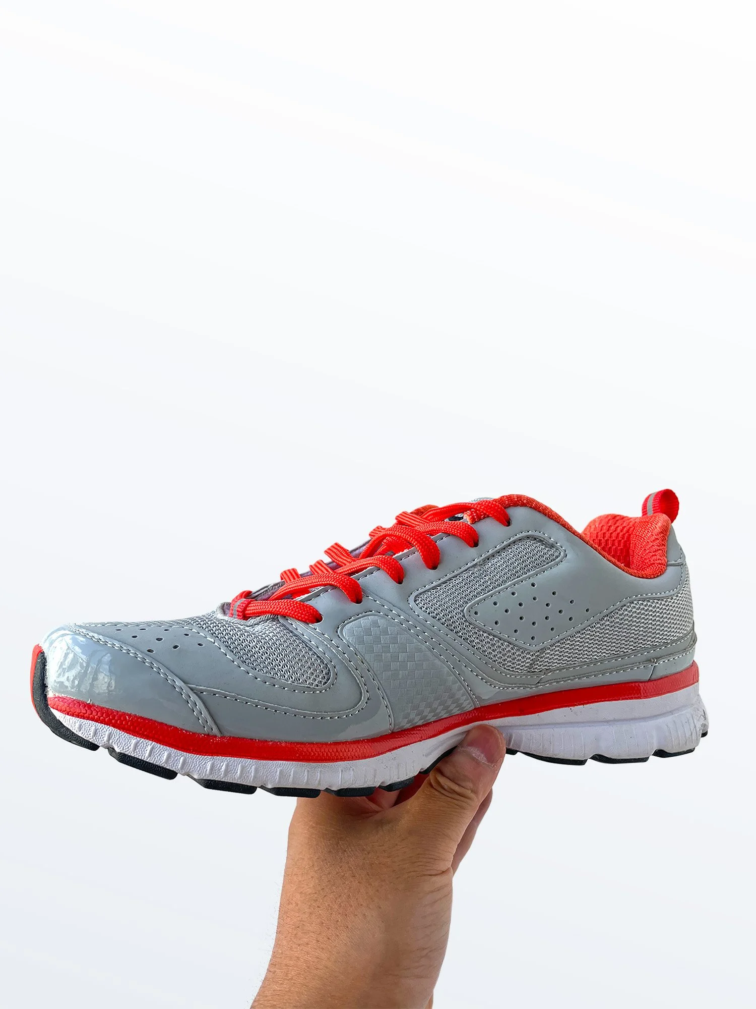
#130520 A Not Great But Decent Running Shoe
-
October 2011 -October 2014
-
Nike, Inc. Asia/UMBRO
-
Full-time senior designer
-
To design and develop a new running shoe silhouette on a half developed outsole tooling adapted from previous design team.
In order to fill the commercial space of UMBRO retailer needs, it is inevitable to create shoes that customers easily grasp towards to. Running shoe is one of those styles Chinese local market can never have enough (even for a soccer brand like UMBRO).
When I was assigned to the project, the initial tooling was still in pre-development technical blueprint stage. I worked with the development team in the factory on details, such as finalizing branding; picking out specific textures; outsole edge radius; midsole flexible gap space sizes; toe bump wrap height; etc.
Also I was able to provide some helpful and critical feedback on this shoe’s last. The original shoe last was quite balky especially the toe area. It was a thick and very roomy toe (which was the intention of the development team.) to give wearer more space when on foot. I was able to convince development team reducing toe thickness in order to have a slimmer overall aesthetic.
This running shoe had a fix (tight) budget, which I was very much aware from the beginning. For example, materials can only be synthetic PUs and meshes from one specific resource with fix prices; also the types of materials I can use are none too special. Since this running shoe is commercial driven style, the upper can’t be too “creative”. All in all it was not a “fun” shoe to design.
I knew I need to give the upper a point of visual interest somehow. My solution was to create an area of interest around UMBRO diamond logo at rare part of the shoe with perforations to give the shoe a light feel. I also designed an asymmetrical toe piece to reduce the roundness of this shoe last used.


