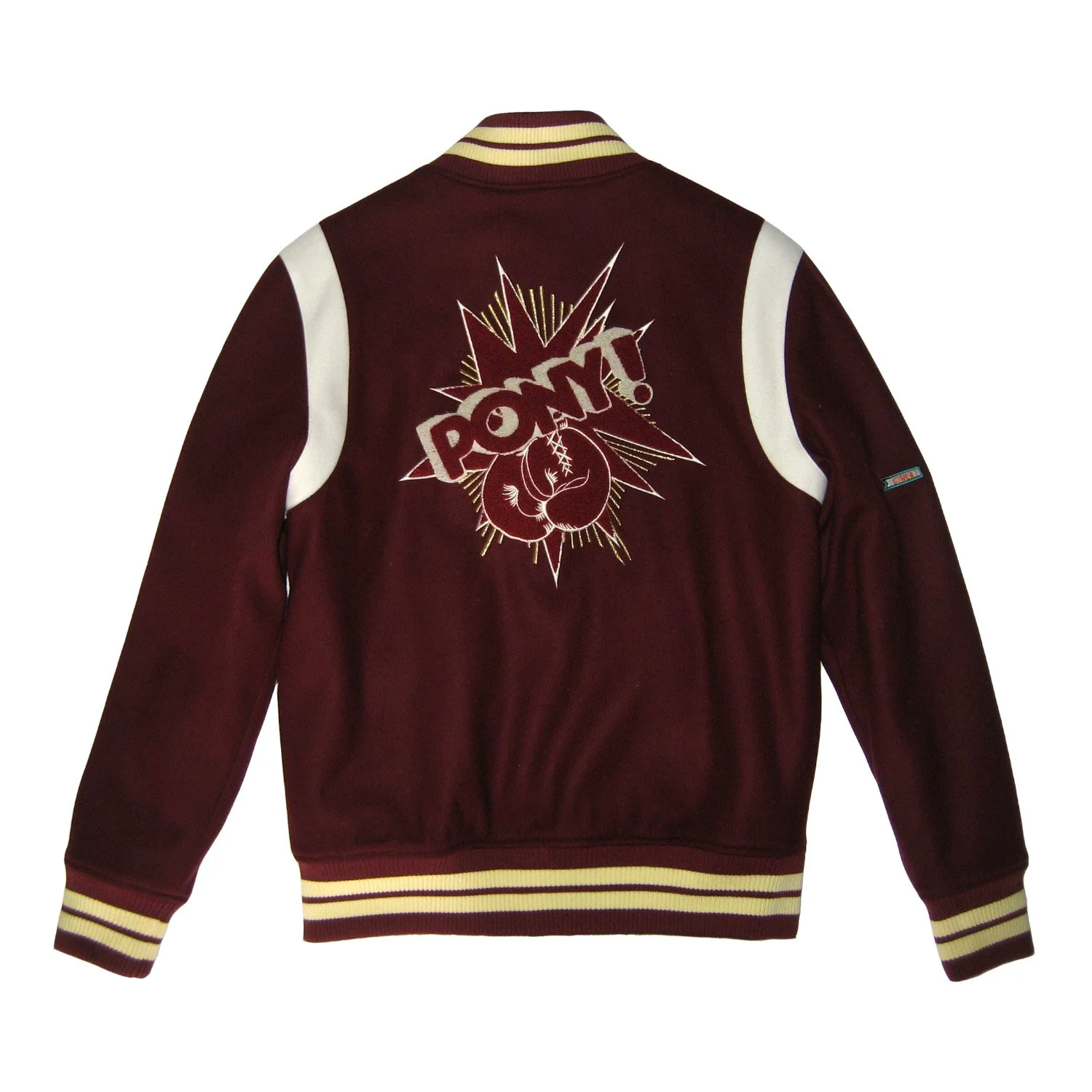
#110920: PONY Archive/2010 Fall/Winter China Only Collection
-
May 2009 -September 2011
-
BaoCheng Group. LLC/PONY
-
Full-time product/design manager
-
In the role of design managing of a team of 6 designers for local mainland China market. Also to facilitate PONY internal designs with mainland China and vice versa.
A lot of work during my time working for PONY China required me stepping outside of my usual footwear focused design area. When I was working for PONY China my job was managing product design along with building a design team and responsible for hiring design talents. At that time a suitable graphic designer candidate was not available. I had to take on some of the graphic design responsibilities myself.
This is a graphic driven special Fall/Winter holiday collection of 2010. During that time colorful, bold graphics were the trend of the market in China to capture young audiences.
I dug into PONY brand archive for inspirations. The idea is to create graphics that has relationships with the brand history. One of the interesting facts that I found is that PONY had heavy influence and investment in major sports during the peak of brand reputations of 90s. One of the sports was boxing. Muhammad Ali used to wear a pair PONY boxing shoes during matches.
I have to admit I am really proud of this hoodie design. The slanted buttons are really unique which make the entire hoodie aesthetically interesting. I love this hoodie design so much that in one version I removed the front PONY brand graphic just to focus on this slant placket design.
With the key graphic direction locked. I looked into graphic styles that drives the 90s culture. The bold and contrast colors of pop art is a none-brainer. In the end I decided on a graphic print that boxing glove is the main element. I also applied the “POW” affect of cosmic book art. This collection consists of a hoodie, a sweater pant, a baseball jacket and a baseball cap and few footwear silhouettes.
For sneakers, I took 2 of the most iconic silhouettes from PONY archive, City Wings and Slam Dunk and styled them by applying bold and contrast color theme. For Slam Dunk silhouette the wide open space of simplicity of shoe style was ideal for all graphic application. This full graphic itself can certainly be improved upon, but the result of applying this graphic application was an excellent decision.
For City Wings I applied the key graphic story onto the tongue of the shoe. However, the tongue graphics are supposed to be a removable velcro attachment, not supposed to be simple screen printing in these samples. The idea of having a removable velcro piece is playful. Plus a removable velcro piece gives a 3-dimension look.
I have always been a big fan of varsity jacket. They are function and fun. Also varsity jacket is a perfect silhouette for applying graphics. One silhouette has a contrast sleeves and the other silhouette has a contrast arm hole.
The overall design and execution of these varsity jackets are not bad at all. However, graphic itself was a bit too much. A simpler version of these graphics can certainly make these silhouette more accessible.
I also introduced a couple of baseball caps using the same graphics in different applications. The silhouette and the choice of baseball caps are spot on. Now looking back on this baseball jacket designs. Just like the varsity jackets graphic applications used on these caps were a bit too complicated.
Overall there were some excellent designs and there were some must improved upon designs in this collections. As a collection of product I think I did a pretty decent job. However, there are many areas of design required a lot more work, especially in graphic design space.


